
Turning insurance into a seamless, all-in-one marketplace
ROLE
TIME
12 weeks
TEAM
1 Senior Product Designer
2 Engineers
1 Product Manager
1 UX Researcher
1 Marketing Manager

CHALLENGE
SoFi’s original insurance flow redirected members to a third-party site with a long, opaque application. Members couldn’t see pricing until the very end, had no way to compare providers, and received little of the convenience they associated with SoFi. Conversion stalled at 4% and the business only captured a one-time referral fee.
OUTCOME
We proved an in-house approach could succeed by launching an agent-led MVP that lifted conversion to 14%. Building on that momentum, my team and I designed a fully automated, self-serve marketplace that brings everything into one place. Members can now receive and compare multiple quotes in a single, streamlined flow, gaining clarity and confidence in their decision. We achieved a 52% month-over-month increase in sales and increased conversion by 3.5x.

CURRENT STATE
The agent-led MVP brought insurance shopping into SoFi, but it wasn’t fully self-serve yet. Getting a bindable quote still required an agent to follow up for additional information. Many consumers were also not familiar with insurance marketplaces or why using one could be better than going directly to a carrier.
OPPORTUNITY
Insurance shopping should feel as simple as the rest of SoFi. We wanted:
One low-effort application across Life, Auto, Home, and Renters.
Personalized coverage recommendations to help members know what they need.
Multiple quotes in one place through rater and carrier integrations.
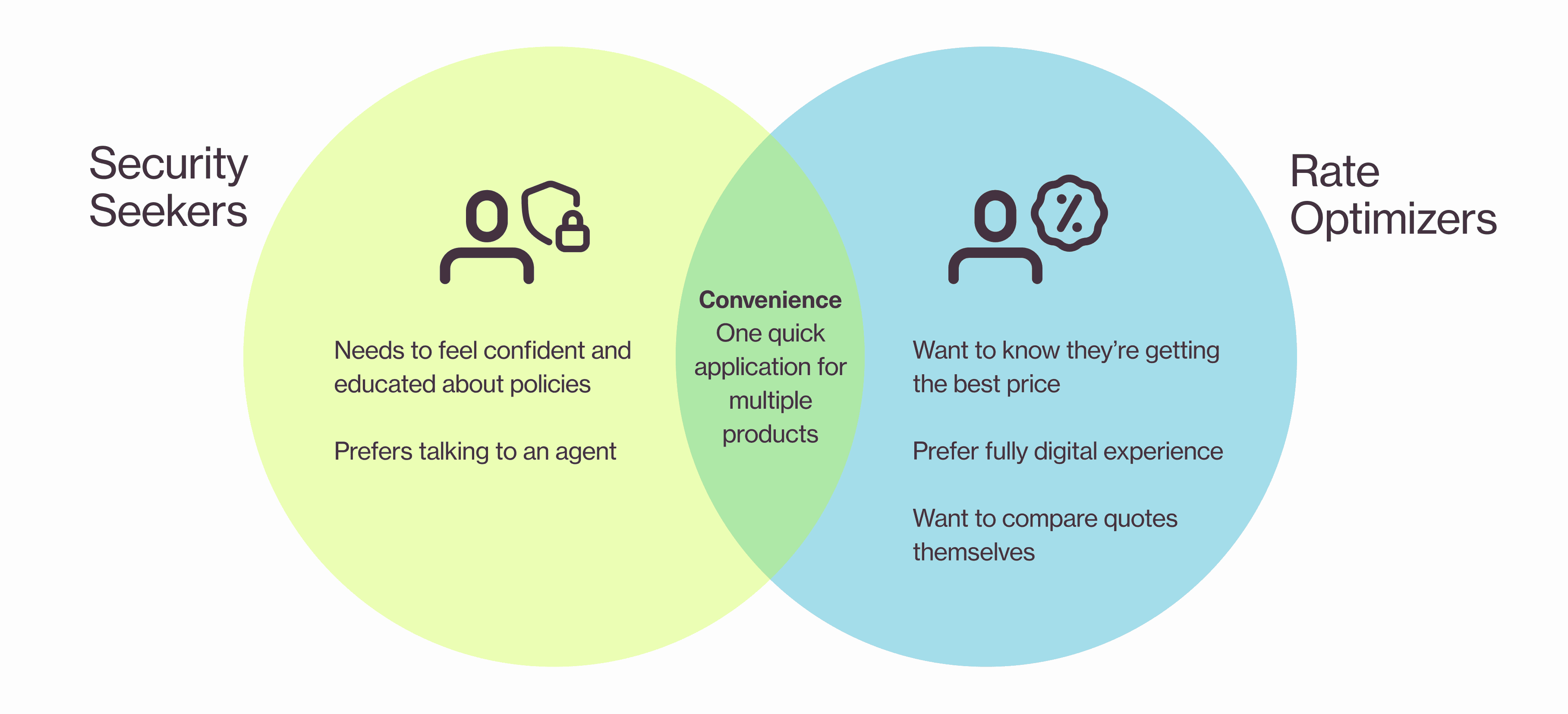
Our research revealed two distinct shopping mindsets. Security Seekers wanted guidance and confidence, while Rate Optimizers wanted control and the best price. Despite different needs, both greatly valued convenience.
HOW MIGHT WE
HMW allow insurance shoppers to conveniently shop for quotes and gain a better understanding of their insurance options?
JOB TO BE DONE
Create a digital-first insurance experience that gives members convenience, confidence, and choice.
Key Design Changes


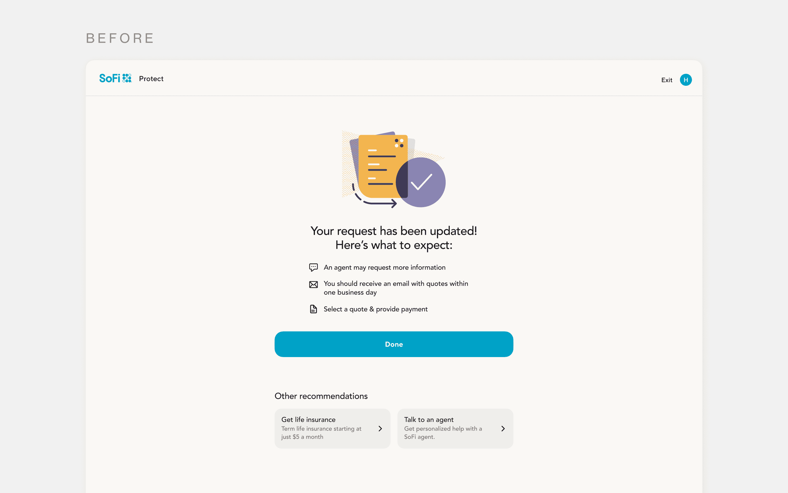

The MVP ended with a handoff to an agent, leaving members without prices or a way to compare options.
The redesigned screen surfaces estimated pricing, carrier options, and key coverage details upfront, so members can compare quotes side by side and understand their options before moving forward. This turned a waiting screen into something actionable.
Zooming into some design choices
Customizing Your Coverage

Fewer people will customize their coverages, because they mainly care about comparing quotes.

People will care equally about reviewing coverage details, editing personal information, and comparing quotes.
This screen lets members adjust coverage and deductibles before choosing a quote. Testing showed users were split between wanting more detail and less detail, so we chose Hypothesis 1 to keep the comparison simple, with customization available when needed.
Selecting Your Coverage Level
Keep the choice simple with short descriptions for each coverage level.

Show all coverage details upfront so members can compare options more precisely.
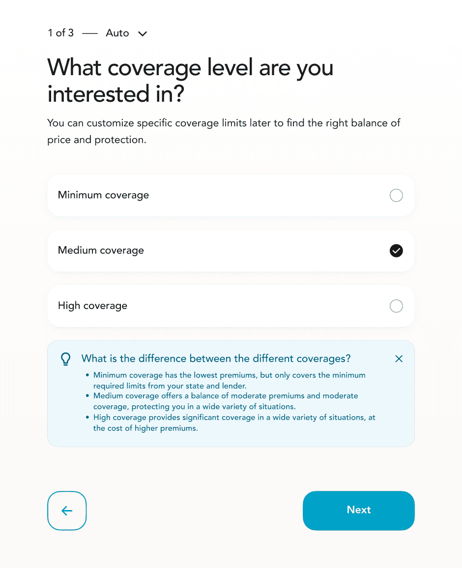
Reveal context based on the selected level to not overwhelm members.

This screen helps members choose a starting coverage level before customizing individual limits later. The simplest version didn’t provide enough context, while showing everything at once felt too dense. We landed on Iteration 3 because it created the clearest information hierarchy. There was enough detail to support an informed choice, revealed only when relevant.
Choosing Your Insurance Type


Show individual products and bundle options upfront to make all available paths clear.
This is the first step of the flow, where members choose which insurance products they want to shop for. We initially liked Hypothesis 1 because it gave bundling its own moment, aligning with Product’s goal of promoting multi-product shopping. But in testing, Hypothesis 2 was much clearer. Members could immediately understand their options and choose a bundle without an extra step.
Impact
Insurance flow completion increased from 4% to 14%.
The experience handled 1,900+ leads in Jan 2026, up from 700+ in Jul 2025.

